A visual addition to my process.
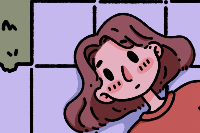
For the past several months I’ve been finishing and touching up the text to my next picture book, My Mom Was A Seamstress. This is an extended and revamped version of one of the stories in my first book, Horror Stories for Weird Children (Histórias de Terror para Crianças Estranhas – 2019).
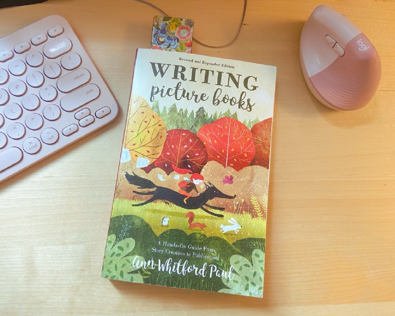
I’ve been reading a lot about writing picture and children’s book, and I’ve also read quite a few children’s book too – as a writer should. Recently I’m going through Writing Picture Books, by Ann Whitford Paul. I’ve been enjoying so much I even bought a copy of it and finally returned the library copy I’ve been holding hostage. If you’re looking for a place to start studying about writing picture book, I’d recommend this one as a good starting point.
One of the things Ann says in the book is “picture books are books for people who don’t know how to read”. This is such a smart way to put to words something so important about this medium – it’s not only about words, this is a PICTURE book, after all. The text will probably be read to the children by the adults in their life (depending on how old these little readers are, of course), but the child will see/read the images. And because of that the writer is given more liberty to play around with the story without necessarily worrying about, for example, describing everything that is happening in the scene – this is the illustrator’s job! Of course, how involved the writer will be in the process is something to be decided by both collaborators.
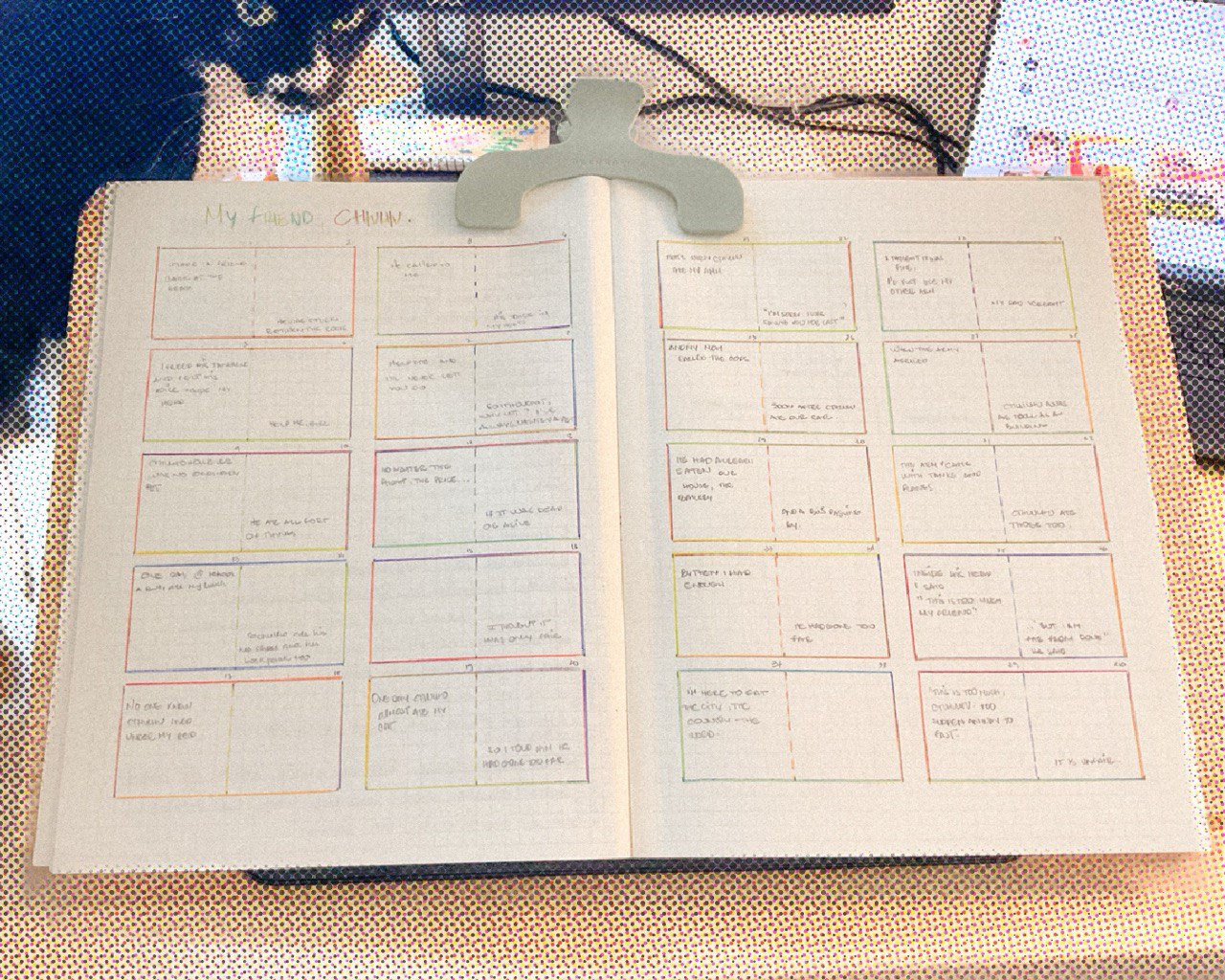
But how have this changed my way of writing the picture book? Well, I started to do the story decoupage physically, and this allowed me to not only have a better understanding of how the story will look on the paper, but it also affected my writing and the decisions I took with the story and words I’m using. It’s silly to think I hadn’t though about it before, and I think I might have even tried to do this with my first book, but I just wasn’t in the rightte place to get the results I’m getting now.
When you position the story in the page, thinking about where the writing might go (up, middle or lower on the page), this helps you understand the flow of the story in the eyes of both the child and adult reader. The position the words are placed can also help the illustrator (and the reader) understand the importance of that particular beat. A lone phrase on the middle of the page passes a different feeling from one on the top of the page. This playful placement when paired with the contents of the story can help induce the reader to the direction the writer intents to.

For example, My Mom Was a Seamstress is a horror picture book, so I’m trying to make use of these placements as a way to emphasize an eerie sense to some of the passages of the book. A lone word in the left lower end of a spread-page may convey a different feeling from it being placed in the centre a page, were it gains a sense of conviction and certainty.
Of course, nothing is set in stone since you are working with an illustrator and they should also have the liberty to illustrate according to what they see. But that’s the fun thing about collaborating, it’s a process that can add meaning and elements to the story you both are creating.
Oh! Here’s a horror-ish children picture book I really enjoyed reading a few months (year?) back: The Skull, by John Klassen.
See you soon!
Leave a Comment